
Editing nature photos can transform good shots into stunning visuals, but it’s easy to make mistakes that detract from the image. Here’s a quick rundown of five frequent errors and how to avoid them:
- Over-saturating colors: Pushing saturation too far makes photos look unnatural. Use tools like the HSL sliders for precise adjustments.
- Over-using the clarity slider: Excessive clarity can create harsh textures and introduce noise. Apply it selectively to maintain balance.
- Crooked horizons: A tilted horizon feels distracting. Straighten it using tools like Lightroom’s Crop Tool or Photoshop’s Skew function.
- Sloppy masking: Poorly refined masks lead to halos and unnatural edits. Take time to refine masks with tools like AI-powered selections and feathering.
- Too much noise reduction or shadow lifting: Overdoing these adjustments can flatten textures and remove details. Make small changes and keep some natural noise.
Avoiding these errors ensures your edits look polished while preserving the scene’s natural feel. Start small, review your work, and focus on subtle improvements.
5 Common Nature Photography Editing Mistakes to Avoid
7 Editing Mistakes That Are Ruining Your Landscape Photos
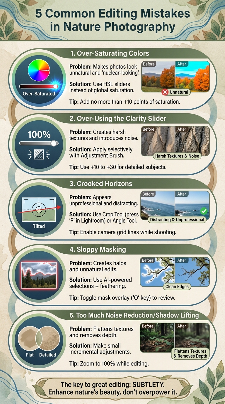
1. Over-Saturating Colors
Pushing the saturation slider too far can make natural colors look unnatural. Over-saturated photos often come across as "nuclear-looking", "too punchy", or "extreme", transforming what could be a beautiful scene into something that feels more like it was edited in Microsoft Paint.
The problem isn’t just that these images look fake – overdone saturation can create visual chaos, pulling attention away from the subject. For example, if you’re photographing familiar elements like snow, grass, or trees, it’s easy for viewers to notice when the colors veer far from reality. In these cases, the edit can end up overshadowing the beauty of the original scene.
A better approach? Skip the global saturation slider and use HSL (Hue/Saturation/Luminosity) controls instead. This lets you fine-tune specific colors – like enhancing the blue of the sky – without turning green foliage into an unnatural neon shade. Many seasoned photographers recommend adding no more than 10 points of saturation, and some prefer the Vibrance slider for its subtlety and greater control compared to the Saturation adjustment.
Want to test your edits? Start by resetting the saturation slider to zero. Then, slowly increase it while watching how the colors evolve. Stop when the colors look naturally vibrant. Taking a second look later can help you spot any over-adjustments you may have missed.
2. Over-Using the Clarity Slider
The clarity slider enhances definition by darkening the edges of objects, but pushing it too far can lead to a harsh, artificial look that undermines your photo’s natural appeal. Instead of cranking it up across the entire image, consider using it selectively to maintain balance.
When you apply 100% clarity uniformly, it often creates competing textures and introduces unwanted noise. This reduces the overall quality and can detract from the viewer’s focus.
To avoid these pitfalls, tools like the Adjustment Brush or Graduated Filter can help you apply clarity more precisely. For subjects with intricate details, adjustments in the range of +10 to +30 usually work best. Photographer Prathap DK highlights that overdoing clarity can result in an unnatural, almost plastic appearance.
It’s also wise to steer clear of adding clarity to soft elements like skies or water. Adam Welch sums it up perfectly:
"Any adjustments you make to the clarity and sharpness of your photo should never make them appear unrealistic (with exceptions) or detract from your original vision".
3. Crooked Horizons
A tilted horizon, even by just a few degrees, can throw off the balance of a photo and draw attention away from your subject. As Spencer Cox from Photography Life puts it, "a non-level horizon appears unprofessional and rushed".
Even slight tilts can make viewers uncomfortable because our brains are wired to notice when something isn’t as horizontal as expected. While a dramatic Dutch tilt can be a deliberate artistic choice, an unintended tilt simply looks like an oversight.
Thankfully, most editing software makes fixing horizons a breeze. In Lightroom, for example, you can use the Crop Tool (shortcut: press "R") and rotate the image by dragging outside the crop frame. For more accuracy, try the Angle Tool: click the ruler icon, draw a line along the horizon, and Lightroom will automatically align it. In Photoshop, the Skew tool (found under Edit → Transform → Skew) lets you adjust the horizon by pulling corner handles, allowing you to straighten it without rotating the entire image, which helps keep more of your composition intact.
However, don’t rely entirely on auto-straightening tools. Instead, aim for what’s called the "perceptual horizon" . Elements like sloping hills or uneven foregrounds can make a perfectly straight horizon feel off. A helpful trick is to flip your image horizontally during editing – this fresh perspective often highlights alignment issues you might have missed. While digital tools are great for quick fixes, honing your in-camera skills will save you time and preserve quality.
To get it right while shooting, enable your camera’s grid lines or built-in leveling tools. If you’re using a tripod, adding a bubble level to the hot shoe can make precise alignment easier . Shooting in Raw format gives you more room for adjustments later, but remember that straightening often involves cropping, which can reduce your image resolution. Taking an extra moment to align your shot perfectly before pressing the shutter can make all the difference in your final result.
sbb-itb-5a98267
4. Sloppy Masking and Selections
After addressing tone and alignment, focusing on precise masking is crucial to preserve the natural feel of your images. Poor masking is a quick way to make nature photos look heavily edited rather than subtly improved. Masking allows you to fine-tune specific areas without making the adjustments obvious.
Some common signs of sloppy masking include halos – those bright or dark outlines – and burned or overly darkened edges around objects like mountains or rocks, which occur when brush strokes extend beyond the intended boundaries. Another telltale sign is when edits, such as sharpening a distant mountain, unintentionally affect nearby areas like the sky or foreground. Over-bright reflections that outshine their source are another red flag of excessive adjustments.
Thankfully, modern editing tools make precision more achievable. Features like AI-powered masks – such as "Select Subject" or "Select Sky" options – are excellent starting points. Once applied, refine these masks using tools like Add/Subtract, brushes, or gradients. The Feather slider can help create smooth transitions, ensuring your edits blend seamlessly. For even finer control, Range Masks let you target specific brightness levels or colors, enabling adjustments to only the pixels you need.
"The key to perfection in post-processing comes with masking." – Kent DuFault, Author and Photographer, Photzy.com
To ensure accuracy, toggle the mask overlay on (hit the "O" key in Lightroom) to review your selections. Once satisfied, switch the overlay off to assess your edits. If something feels off, use the Eraser tool to clean up problem areas. Taking the time to refine your masks will help your edits elevate your nature photography rather than detract from it.
5. Too Much Noise Reduction or Shadow Lifting
Overdoing noise reduction and shadow lifting can strip away the natural texture of an image. When you brighten shadows too much, you’re exposing areas that originally captured very little light. This often results in noticeable noise. The instinct might be to crank up the noise reduction, but that can create a problematic cycle. As Austin Jackson from Visual Wilderness points out: "The more you reduce the noise, the less detail your photo has, and the less depth you’ll see. Too much noise reduction can cause your photo to look like a painting". This highlights how over-processing can rob an image of its natural depth.
Shadows are supposed to be darker than highlights. Flattening the brightness across an image eliminates the contrast and depth that make photos feel three-dimensional. To avoid this, use your editing software’s shadow clipping indicator to ensure you’re not pushing adjustments too far.
To preserve texture and detail, zoom in to 100% while making changes and proceed cautiously. For noise reduction, stop as soon as you notice fine details starting to disappear. A little noise is often better than a smooth but lifeless surface – especially in low-light nature shots where texture is key. For shadow lifting, stick to small, incremental adjustments instead of dramatic shifts.
"Subtlety is the real key – personally, I feel that post processing should not distract from an image rather it should enhance or compliment the photograph. If the first thing you notice upon looking at one of your images is the edit then you’ve probably gone too far." – Mark Denney
Take a break and revisit the image later with fresh eyes. This can help you catch over-processing that might have seemed fine in the moment but now feels unnatural. The goal is to enhance the beauty of what nature provides, not to create something artificial.
Conclusion
Thoughtful adjustments can enhance the natural charm of your photos without overshadowing their essence. By steering clear of these five common editing pitfalls, you can keep your nature photography looking both polished and authentic. The key is to avoid over-editing – make subtle improvements that enhance the image while keeping the original scene intact.
Subtlety is the secret to preserving the true spirit of nature. As photographer Andrea Livieri wisely notes:
"Most of them are about finding the right balance between too much and too little of something".
Striking this balance ensures your edits highlight nature’s beauty without compromising its authenticity.
Editing is a skill that grows with time and practice. Revisiting older photos can be a great way to refine your techniques, and taking breaks allows you to review your work with a fresh perspective. Every careful edit you make is a step toward improving your craft.
FAQs
How can I prevent over-saturating colors in my nature photos?
When editing nature photos, aim for subtle and precise color adjustments to keep the image looking natural. Instead of cranking up the saturation across the board, try using tools like the vibrance or HSL sliders. These give you finer control over specific colors without overwhelming the entire photo. Always check your edits against the original image on a calibrated monitor to ensure the colors remain true to life. Remember, color tweaks shouldn’t be a substitute for fixing issues like poor composition or lighting – focus on enhancing the strengths of the image without going overboard.
What’s the easiest way to fix a crooked horizon in nature photos?
To fix a crooked horizon effortlessly, tools like Photoshop’s Ruler Tool or the Crop/Transform Straighten options come in handy. If you’re using Lightroom, go to the Develop module and try the Straighten Tool for accurate alignment. These features help you quickly achieve a clean, professional finish.
How can I avoid over-editing when reducing noise and brightening shadows in my nature photos?
When working on noise reduction, start with moderate adjustments. Zoom in to 100% to focus on the grainy areas and ensure you’re not softening important details. When brightening shadows, use the shadows slider carefully – just enough to reveal details without overexposing or flattening the contrast. Keep an eye on clipping indicators to maintain balance. For optimal results, always start with a properly exposed RAW file, reducing the need for extensive post-processing.